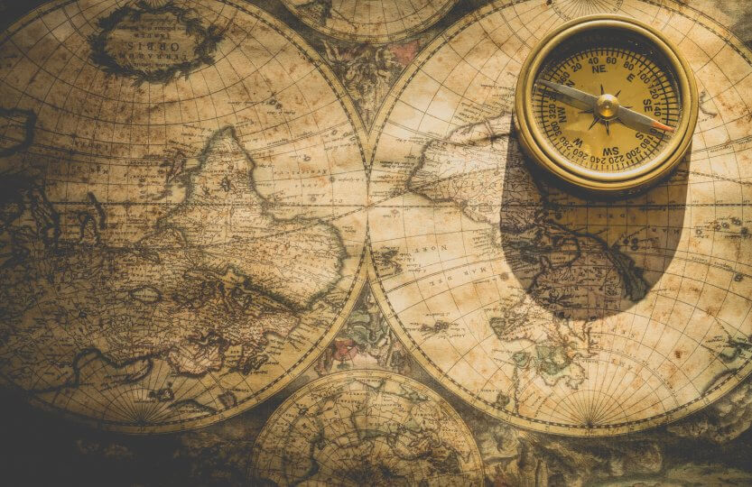
Maps are fun, colourful, and informative. In my faculty at the University, almost every research paper comes with maps. However, I believe that there is a lack of “mapucation” (map education) or understanding of how to properly use, interpret, and even misinterpret maps. This blog entry will hopefully be thought-provoking and add additional angles to consider when making and reading maps. Throughout the post, you will find some guiding questions.
Throughout history, people have been creating maps to represent spatial objects. We naturally think in terms of spaces and the relationships between them, such as the location of a river, our address, our community, and so on. Thematic maps that showcase data related to specific topics, such as biogeography, health, and diseases, have become more prevalent in recent times, although antique examples from the Renaissance period can be found. It is difficult to think of these topics without picturing a map, whether it’s the spread of mosquitoes, nutrition levels around the world, or the local incidence of COVID-19. We have become accustomed to regularly checking COVID-19 incidence maps to see how carefully we should interact with others.
Mapping (in the sense of creating maps) requires multiple steps. Firstly, someone needs to gather data that will be referenced in space and time. Thanks to satellites and countless cartographers, researchers can start with a seemingly blank canvas (map) and add their own data. Another person may then use this data, presuming it to be correct and methodologically sound. The mapmaker does not need to know the original data gatherer’s intention. Instead, they create colourful maps and graphics to represent the data. The choice of map projection, of colours, and the choice of explanations or lack thereof – all this is part of one data interpretation by the mapmaker.
What is the nature of knowledge gained from the map?
As a reader, it is your task or rather your choice to hermeneutically translate this map and extract knowledge or explanations that are useful for you. However, the nature of the knowledge gained from the map is subjective. What you interpret from the map may vary greatly from what others interpret or what the mapmaker intended to convey. Miscommunications are inevitable. While some of these miscommunications may be harmless, others can reinforce stereotypes and preconceived notions about the state of the world. This can shape people’s realities, mindsets, and values (Wood, 2010 & Winther, 2020). Additionally, the social context that surrounds a map can be disguised as seemingly objective truths.
Does it make sense to showcase average differences between countries, even though the standard of living in bigger cities in Africa is comparable to “the West”?
A noteworthy example of how important context can be is the representation of Africa on many thematic maps. Within studying global changes and health, we became so used to Africa having “different colours than the rest” on thematic maps, whether we talk about nutrition, diseases, or education. The maps are more focused on showing and predicting, rather than explaining causal relationships (Winther, 2020). This raises the question of whether it is reasonable to showcase average differences between countries, even though the standard of living in major African cities is like that of Western cities. Furthermore, the categories used in maps, let’s say “no. of high-ranking universities in countries” are defined by some institution. This institution comprises a “Benennungsmacht”, a monopoly on setting categories of good/bad, setting indicators, and claiming to be “objectively right” (originally Bordieu, discussion at Mau, 2017). This approach disregards local individualism, and forces globally normed knowledge. In other words: qualitative differences are turned into quantitative inequalities. While this way of thinking is rooted in the realm of social science it has not quite reached the natural sciences. We could say that objectively it is better that fewer people are sick, or that some level of nutrition is better than others. But there are many cases where the categorisation, hierarchisation or metric is not inherently clear and may lack a rationale.
How does the reader experience maps? What consequences does this experience have in turn on the values and actions of the reader?
Another miscommunication stems from careless mapmaking and bad explanations of maps. This is particularly true for maps that are based on models, as it can be easy to misinterpret the information presented. Is this a scenario, a projection, a forecast or what is shown? Should I be afraid that this disease will spread over parts of Europe, or is this an external explorative scenario? Furthermore, there is a lack of research on the use of thematic maps in the fields of biogeography and health, which further complicates matters. A recent example of this is the discourse on “alarmist” colouring of Covid maps. Comparatively low incidences of Covid-19 were conveyed by a colouring scheme that some claimed to be harsh, alarmist and not appropriate for the situation. This is to show that maps have real effects on actions, going outside or staying home, feeling safe or scared, showcasing the power of maps.
Tom Sawyer, what’s a map for?
Ain’t it to learn you facts?
– Mark Twain
In this article, we explored some of the fallacies of mapmaking, such as misinterpretations and the institutions that govern classifying systems, as well as the formation of realities and their impact on our actions. Maps are a tool that represents a construct of what is out there. They can teach us about the nature of the land, like a picture of a landscape, but if we want to learn more, we must still go and visit the actual landscape. Maps can only capture what is measurable within our Western scientific framework.
Cartography used to be the interface of “art, science and technology”, with modern GIS systems we might lost the art, what does that mean to mapping and cartography? (Harley, 1989 & Winther, 2020).
Many of the maps we see today have lost touch with reality, as they are based on models or projections and have become more complicated as the data behind them has grown. Early maps only showcased single pieces of information, but advanced maps are now harder to judge and interpret. We need to be aware that maps are tools for us to understand and act in the real world. Without clear intent to be used in the real world, a map is just a picture.
What does this map tell me or someone to do?
Maps hold power and guide our actions, construct and overturn beliefs, and in the end, shape our perception of the world.
Thank you for taking the time to read until the end. I hope this text has sparked some questions and ideas, and I would love to hear your thoughts on the topic. Do you have any particularly good or bad maps in mind?
This blog entry was written within the seminar “Current Research in Health Implications of Global Change” by Dr. Stephanie Thomas.
References
Harley, J. (1989): Deconstructing The Map. Cartographica Vol. 26 No.2
Mau, S. (2017): Das Metrische Wir – Über Die Quantifizierung Des Sozialen. Suhrkamp
Twain, M. (1894): Tom Sawyer Abroad.
Wood, D. (2010): Rethinking The Power of Maps.
Winther, R. (2020): When Maps Become the World. The University of Chicago Press

With a background in Environmental and Sustainability Science from Lüneburg, my interest is especially in biodiversity and the dynamic interplay of humans with nature. I love to take pictures of animals and getting close to wildlife. Outside of that, I'm passionate about playing, listening to, and dancing to all sorts of music.

very good content!!!!
very useful blog
good